I hear a version of the same question from almost every executive team I sit with: “what should our AI strategy be?” It’s asked as if there’s one answer, applied uniformly across the whole business. That’s the wrong question, and it’s usually why the strategy that follows doesn’t survive its first year.
There’s a better way to ask it, and I didn’t work it out from a book.
Wardley’s method was introduced to me by the then CTO of Telstra, Vish Nandlall and the then director of architecture Vic McClelland, and it changed how I think about strategy from that point on. What Simon Wardley had worked out is something most strategy consulting doesn’t like to admit: technology doesn’t evolve randomly.
Compare that claim to the tool most strategy work still defaults to: the 2×2 matrix. Draw two axes, argue about where the lines fall, then drop each initiative into a quadrant labelled something like star, question mark, strength or weakness. It looks rigorous. It rarely is. The axes are usually a judgement call dressed up as an analysis, and “strength” and “weakness” are opinions held by whoever’s in the room and most persuasive that day. Two executives can look at the same initiative, cite the same facts, and place it in opposite quadrants, because nothing in the matrix can adjudicate between them. It’s a hypothesis about the business, presented as if it were a finding.
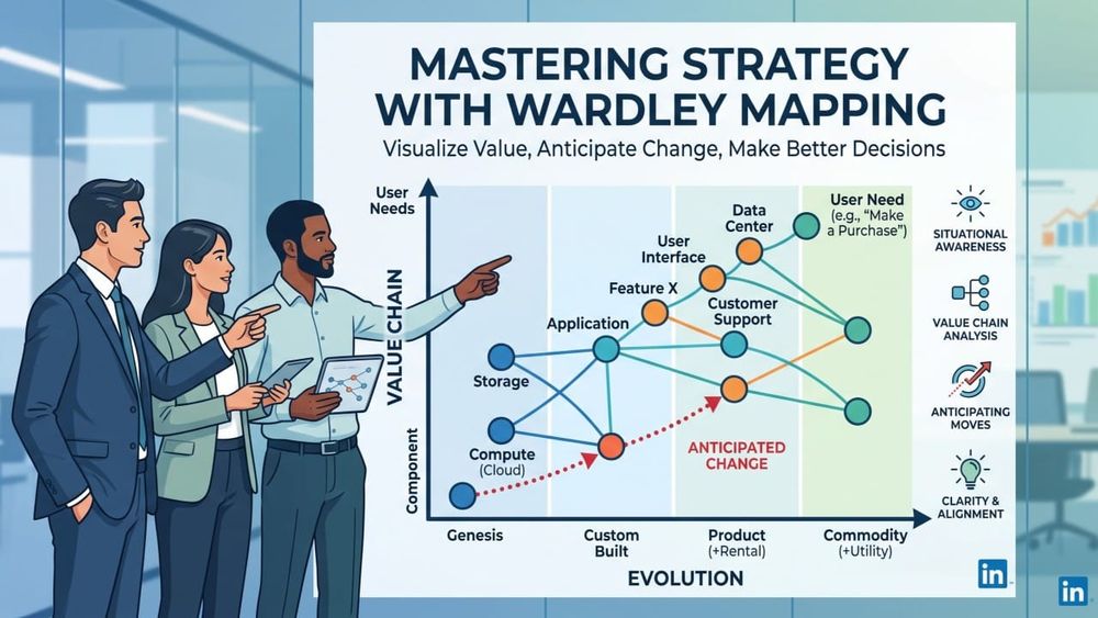
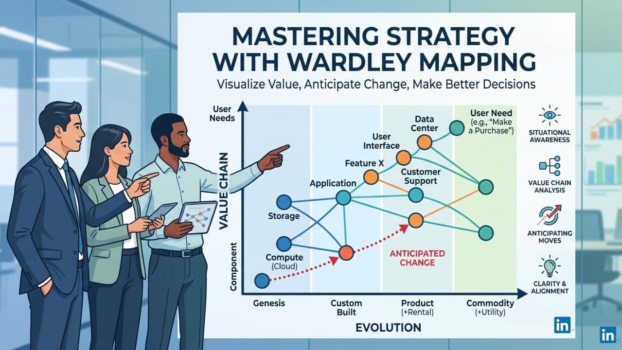
A Wardley map swaps one of those subjective axes for something you can actually check. Not how strong or weak a capability feels, but how far it has travelled along a path every technology takes, from novel to industrialised, pushed along by pressure you can point to: rising customer demand, competing suppliers entering the market, published standards, falling price. That’s why it moves through recognisable stages rather than sitting still in a quadrant someone argued for in a workshop: a novel, expensive, uncertain thing that barely works, then a custom-built version competitors start copying, then a packaged product, then a boring, standardised utility nobody thinks about anymore. Electricity generation made that journey. Compute made that journey, from mainframes companies built themselves to racks in their own data centre to a utility you rent from a cloud provider by the second. Large language model access is making that journey right now, fast enough to watch in real time.
With AI, the genuinely novel, defensible thing is rarely the model. It’s what you build with it for a specific customer, in a specific context, that nobody else has bothered to solve yet.
That evolution isn’t mystical. It’s driven by supply and demand, competition, and the ordinary pressure of ubiquity, which is what makes it predictable enough to plan around. And that predictability is the whole point of drawing the map. If you can see roughly where a component sits on that evolutionary path, you can anticipate what happens to it next, and you can stop applying the wrong kind of management to the wrong kind of thing. I still see boards fund a bespoke internal platform team to rebuild infrastructure orchestration that’s already a rentable commodity, while treating the one AI-driven capability that actually differentiates them as something to hand off to a vendor for speed. Both decisions are backwards. Genesis-stage work needs slack, experimentation and tolerance for failure. Commodity-stage work needs efficiency, standardisation and no further heroics. Confuse the two and you either strangle your one real advantage or burn capital reinventing a utility.
That’s the pragmatic case for mapping: it turns “are we doing AI” into a much sharper set of questions. Where on this chain are we genuinely defensible? Where are we exposed, because a component we’ve built our advantage on is about to commoditise under us? Where are we quietly wasting money treating something ordinary as if it were still special? A map answers those questions in a way a strategy deck built from slogans never does, because a map forces you to be specific about components, not vague about “digital transformation”.
Here’s the part I think gets missed, the evolution axis is shared physics: it applies whether you like it or not, to every company in your sector. But the map itself cannot be bought, templated, or handed to you by a consultant. It has to start from your own anchor, the actual user need you exist to serve, and the real chain of components, visible and invisible, sitting beneath that need as your organisation actually experiences it. Two companies in the same industry, using the same cloud provider and the same foundation model, will draw two genuinely different maps, because their users, their dependencies, and their exposure are different. The evolution is predictable. The map is yours alone, and it only tells the truth if your team actually argues about where each piece sits, out loud, on a whiteboard, rather than inheriting someone else’s diagram.
That’s also why it’s cheap and fast in a way most strategy work isn’t. It doesn’t need a six-month engagement. It needs an honest afternoon and a willingness to disagree about where things really are, not where the org chart says they should be.
Two questions to consider:
- Where in your business are you still funding something as if it were novel and defensible, when the market has already turned it into a commodity everyone else is renting?
- And where are you treating your actual differentiator as routine, standardising or outsourcing the one part of the chain that’s supposed to be the reason customers choose you over the competitor next door?
More information in https://www.swardleymaps.com/
Our reach out if you’d like to learn more.